Description
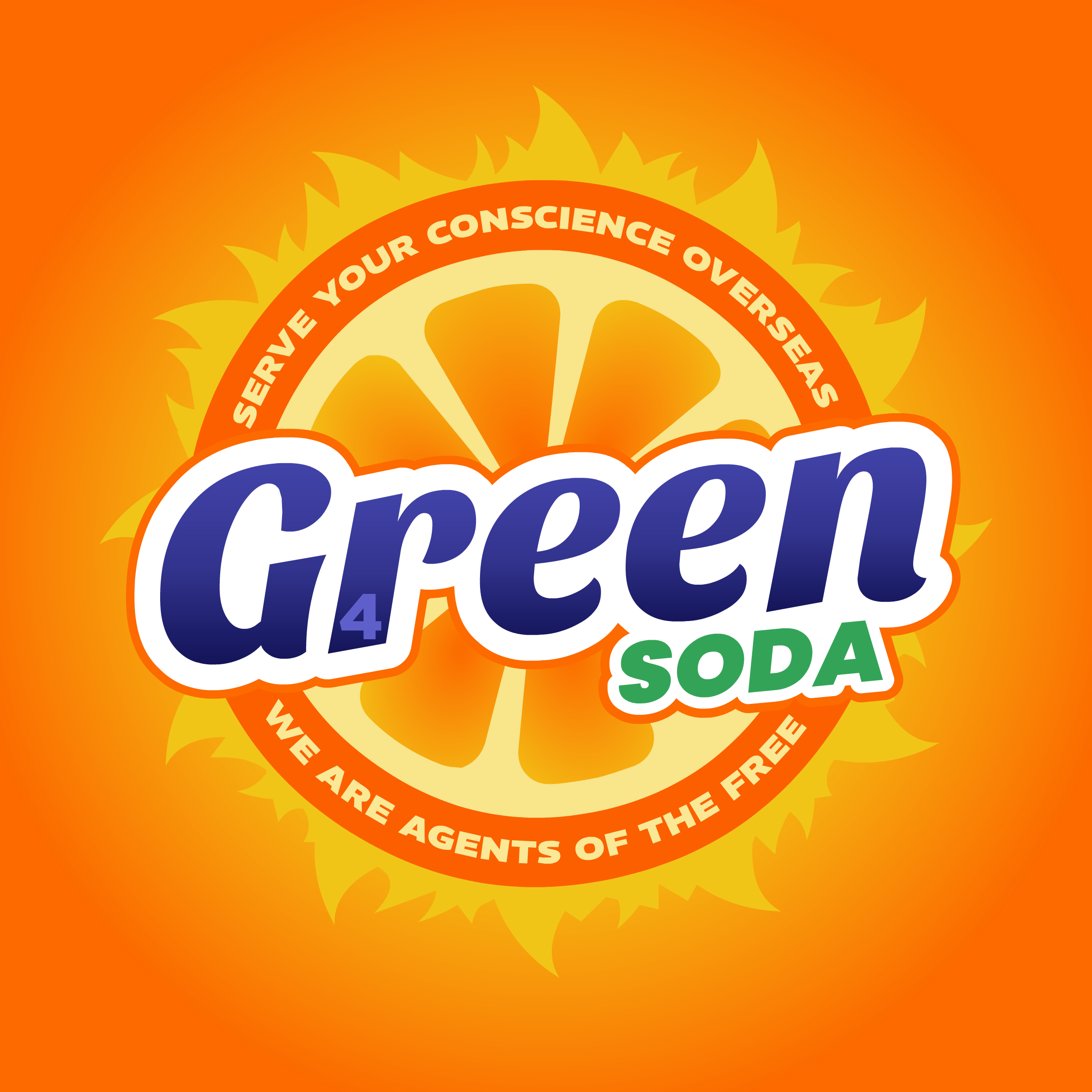
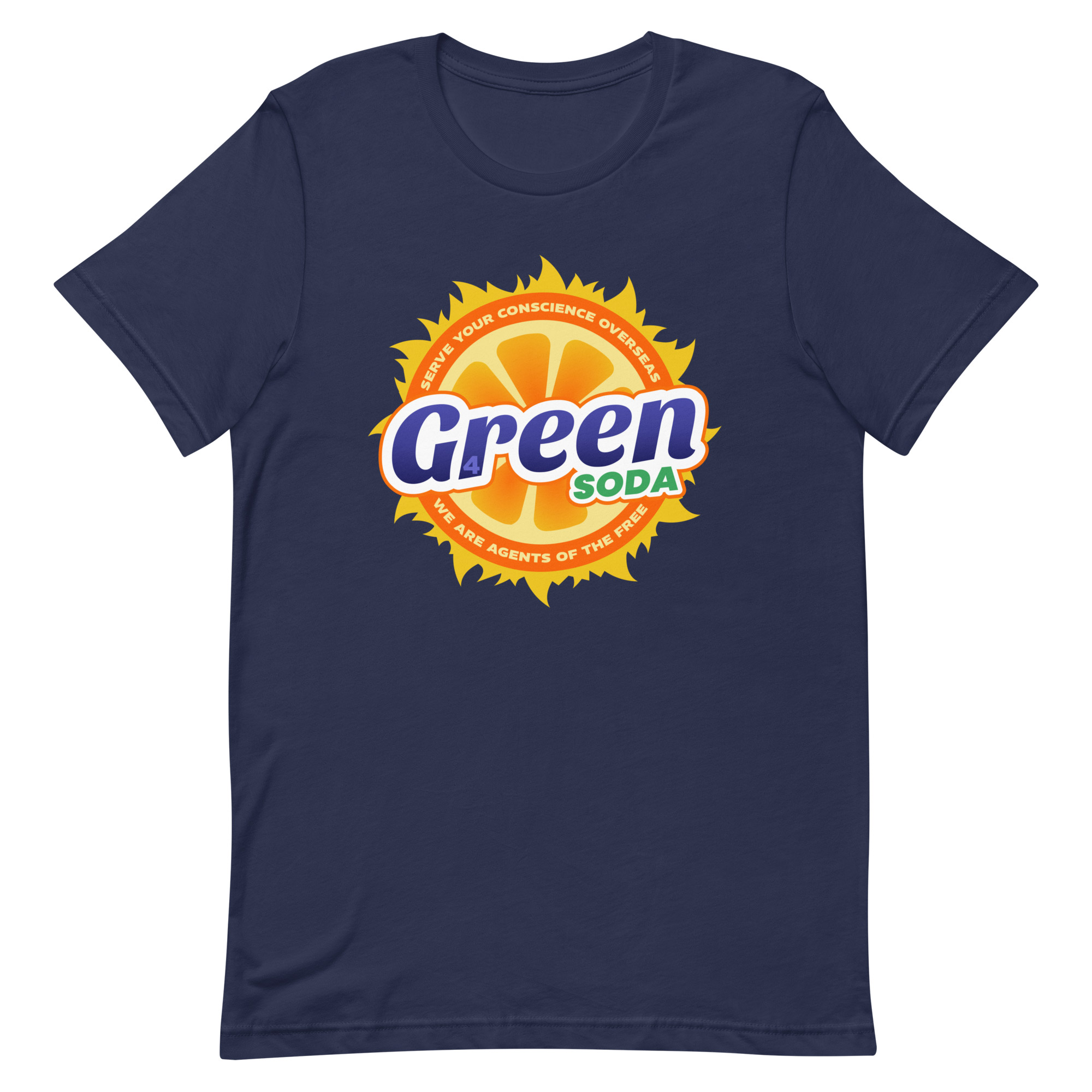
Very difficult to invent an orange juice drink without mentioning the word ‘orange’, I’ve discovered. So we’ve gone with the album title. Let me explain to you why that works. The album artwork is also orange. It really is that easy. If you’re a true REM afficionado, you’ll know what the number 4 on the letter ‘r’ is all about. The original vinyl release featured embossed and laminated lettering and because the ‘r’ key is near to the number 4 on the keyboard, it accidentally got included. From what I can gather from the internet, this was spotted before the pressing, but they liked it and kept it in. Hence why track four in the album listing reads ‘R. Stand.’ rather than ‘4. Stand’. Who knows why they did this.
On the design side, I’ve gone with some roughly 1980s based fizzy orange drinks. Notably Sunkist, if you remember that. Weirdly, those logos join the letters ‘u’ and ‘n’ across the board, which I certainly didn’t notice at the time. Probably out of my mind on tartrazine or whatever chemicals were acceptable in the 80s.
The song is pretty horrible, though. Vietnam, agent orange, mutations from exposure agent oragne, etc. Subject matter-wise it’s horrible, I mean. Sonically it’s absolutely amazing. Still.

